The NAEP 2007 reports leave me without real understanding of the results, and charts included in the reports do not help. Looking at the state and ethnic data in a slightly different but very simple way, information that seemed to be lacking in the official reports stand out.
For the first steps, we’ll look at only the 4th grade math scores by state.
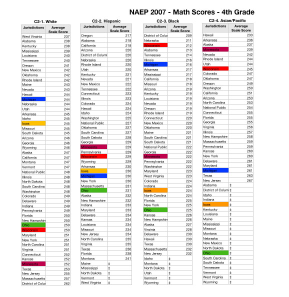
The following is the state (jurisdiction) data by ethnic groups which I will use throughout. I’ve highlighted several of our neighboring states: Wisconsin in red, Michigan in blue, Iowa in yellow, Ohio in green, Minnesota in lavendar.
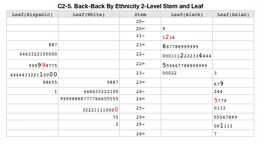
Using a simple 2-level stem and leaf plot shows a general skewed normal (bell curve) distribution for each ethnic group. Scores of the states mentioned above are in a larger font, with Wisconsin further in red. The stem portion of this chart consists of the first two digits of a state’s score (with a – or =), and the leaves are the final digit. A stem ending with – will have final digits of 0-4, a stem ending with = are for scores ending with 5-9.
The Hispanic score seems bi-modal, with the White distribution showing a slight tail on the high side, Blacks and Asian distribution showing low end tails. Asian scores show a definite tendency to score on the high end of states scores, while white scores are definitely skewed to the low end. What can be seen here also, but subtly, is there does not seem to be an overlap of the aggregated state scores for whites and blacks. For Blacks in Wisconsin generally, the chart visually represents the quality of education Wisconsin they are receiving here — very poor.
Of course, this says nothing about how well individual students did on the test — aggregation hides most information that is necessary to make data-driven decisions.
We need to spread out this chart’s distributions to detect other interesting facts.
In this 5-level stem and leaf chart, the stem values end with the symbols -, t, f, s, =, where the – bin is for scores ending with 0 or 1, t for 2 and 3, f for 4 and 5, s for 6 and 7, = for 8 and 9.
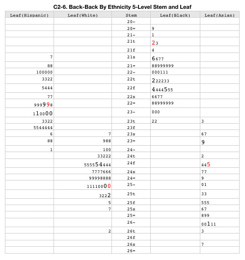
Now we can see most definitely that the distributions for blacks and whites do not overlap, that Wisconsin Black scores are way out in the tail of the distribution. Looking at the extremes of these distributions show surprising results (at least to me). Notice that DC whites score at the top and might be statistical outliers, while DC Blacks are at the opposite end and also may be statistical outliers, and the NJ Asians are at the top, but unlikely to be outliers due to the wide spread of their state average scores. (Outliers are points that are numerically distant from the main distribution).
The DC results by ethnicity for whites was surprising. Looking only at the state scores without separating by ethnicity, the distribution of points look like:
A separate calculation shows that indeed, DC is an outlier when ethnicity is ignored and is only 2 points away from being an extreme outlier. (The outlier cut-score is 224 and the extreme outlier cut-score is 212, DC score is 214).
Going back to the disaggregation by ethnicity the summary calculations are
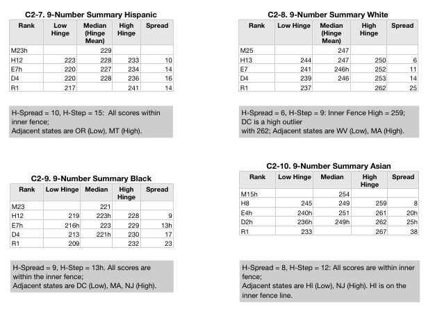
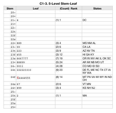
The 9-Number Summaries are used to calculate outliers, and determine drift in the distributions. Each row of the summary table is a kind of percentile. Line M is the median, H represents the low and high 25%, E is the low and high 12.5%, D is the 6.25% cut point, and R represents the range lowest and highest values. (The numbers following these letter designations are the score rank at these cut points).
With a score of 212, Wisconsin Blacks score in the lower 6% of the states (D4 is 213) but this score does not make it an outlier, but that is hardly a badge of honor given how poorly all states are doing. Wisconsin Hispanics score at the median of all Hispanics with a score of 229, and Wisconsin Asians score on the cusp of the lower 25% of all Asians at 245, and Wisconsin whites score on the cusp of the upper 25% of all whites at 250.
The drift calculations (in the Median column) do not show distribution drift, but outlier calculations do show that DC whites are high-end outliers. (A little preview of the NAEP 8th grade math: NAEP numbers show that there was not enough whites in DC public schools by 8th grade to be measured — in our nation’s capital, the public schools are fully segregated?)
Surprisingly, Hawaii (HI) in the Asian category is on the cusp of being an outlier at the low end with a state score of 233.
The HI score was surprising to me since it has a very large Asian/Pacific Islander population, and I expected this ethic group to have the political power to ensure schools would function for them. However, further reading indicates that whites are the upper class and have the power, followed by people of Chinese descent. The rest, native Hawaiians, Japanese, and other Pacific Islander groups are at the bottom of the power and wealth hierarchy. Without a better ethnic categorization, the NAEP test will not show the likely educational imbalance among franchised and disenfranchised.
Continuing with the Asian/Pacific Islander category, I was surprised to see NJ as the top state. At 267, NJ is not an outlier (the cut point is 271), but it is close. An improvement of 1/3 grade level (assuming 12 points separates one grade from the next), would bring them to high-end outlier status.
Looking at the scores for Wisconsin Blacks, it’s quite clear that Wisconsin (Milwaukee schools primarily?) are doing very poorly for Blacks. It’s not just a matter of how the scores rank among states, but how Wisconsin fits within the distribution of all states. The data above shows not only low rank but Wisconsin Blacks are educated with far below the efforts of other states, represented by the main body of the distribution.