The question was recently asked on this site as to how teacher experience compared with poverty levels by school. Using the 2004-05 school data provided in the 2005-06 detailed budget, I compared low-income percentages with: number of years’ experience; % of teachers with advanced degrees; student / teacher ratio. Below are summary charts for all schools in the MMSD.
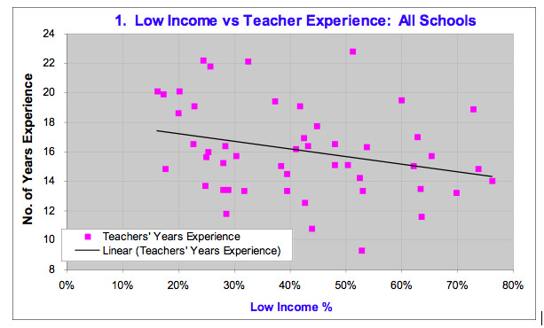
The first chart compares each school’s low-income percentage with the average number of years of experience their teachers have. Each pink data point represents a different school within the district. For example, the highest point on the chart represents Schenk Elementary School, which had 51% low-income (reading from the x-axis), and an average teachers’ experience of 22.8 years (reading from the y-axis). The black line is the Excel-generated trend line depicting the relationship between teacher experience and school poverty levels. Notice that the points in the chart are widely scattered – they are not closely surrounding the trend line. This dispersion implies a very weak relationship between teacher experience and poverty levels. The very weak relationship that does exist suggests teacher experience declines slightly as low-income levels increase. The oft-stated lament in this country is that as teachers become more experienced, they gravitate toward the “easier” schools with fewer low-income kids. In the MMSD at least, that gravitation appears to be occurring at a remarkably slow rate.
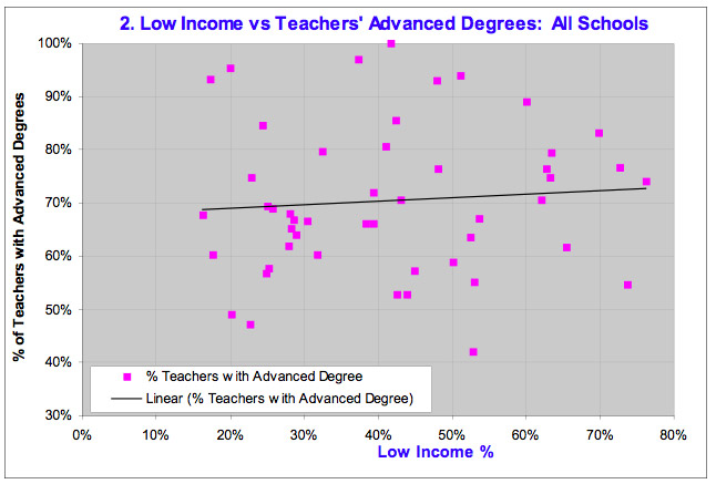
The second chart compares low-income percentages by school with the percentage of teachers that possess advanced degrees. For the MMSD, as school poverty levels increase, there is a slight increase in the percentage of teachers with advanced degrees. However, the relationship is virtually non-existent. Nonetheless, the general literature in this country would suggest teachers with advanced degrees tend to gravitate to schools with lower poverty levels.
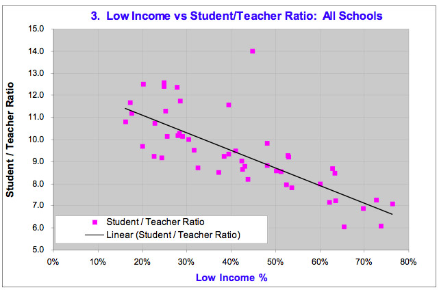
Finally, the third chart compares school poverty levels with the student / teacher ratio. Here there is a very clear relationship: the student/teacher ratio declines as low-income levels increase; (i.e. there are more teachers per student as poverty increases). Unfortunately, there is one important caveat here: schools with higher levels of poverty typically have more students requiring special education or English as a Second Language. To a certain extent, the lower student/teacher ratios reflect the higher number of teachers required to meet those additional needs. Therefore, one has to be careful precisely how to interpret this chart
Peter,
Unfortunately, at this time I can not view the charts (5:00 pm 7/19/06), I can only interpret your comments. Could I some questions for you to answer?:
Did this presentation of data include consideration of teacher turnover or their number of years within each specific school?
Is there a timeline interpretation that considers how communities feeding into a particular school change the demographic make-up?
How have our schools changed in the past 10 years and why?
“Higher levels of poverty *typically* have more students requiring special education…”
Does the data from MMSD support this statement?
The teacher experience data used for the charts came directly from the detailed 2005-06 budget. That report has two pages of data for each school, including the referenced data on teacher experience and % of teachers with advanced degrees. It does not provide info on teacher turnover or teacher experience within each individual school itself. I do not know if the district has such data readily available.
The district’s website has low-income enrollment figures by school, dating back to 1991: http://www.madison.k12.wi.us/re/t8.xls ; (it’s under District Information\District Statistics\District Data Profile\Enrollment Information\Low Income Enrollment by School).
As has frequently been mentioned on this blogsite, and elsewhere, low-income enrollment percentages have increased substantially in the MMSD over the past 10+ years. Many reasons have been offered: urbanization, demographic make-up of people moving to the city, home prices pricing out middle-income families, etc. Passage of the new school referendum this Fall should help slow that trend a little.
For the MMSD, the correlation between special education levels and low-income is weak, though special education levels tend to increase slightly with low-income levels. The correlation is tighter and more pronounced when ESL is included.
Peter–
Do you know what the correlation is between autistic students and income? I’ve heard some say that Madison has become an autism center, drawing families from elsewhere due to the high level of services provided relative to other states but perhaps as important the presence of Waisman.
Related then to your analysis — is there a higher income/autism tie? If so, what does the correlation between the rest of special ed and income level look like? And do you have the figures for what portion of the special ed budget goes to autistic students as well as their per pupil spending?
I’m not picking on the families of autistic children, just wondering if the overall data arent’ skewed by factors not generally discussed.
Thank you for doing this Peter. It’s great to see the data so succinctly correlated!
The relationship between low income schools and “inexperienced” teachers is interesting to think about because the perception is that it is a bad thing to have less experienced teachers….but in practice I don’t necessarily think that’s true. I’ve seen plenty of “experienced” teachers in Madison who have had a very difficult time adjusting to the changing demographics and aren’t necessarily a good fit for their school, while younger teachers coming out of school have different attitudes and motivations to work with diverse populations and can actually be more effective. Of course, a good teacher is a good teacher, whether s/he has 2 years of experience or 32 years. I’m not surprised that the chart shows that there is little correlation between years of teacher experience and school poverty….teachers will tend to want to teach at good schools, and, fortunately for us, the high poverty schools in Madison are really good schools.
Hi Peter,
Thank you for pulling this information together. Did you notice any difference in the scatterplot in the following categories: a) elementary, middle, high schools and b) part of town – east and west, or north, south, east, west?
Again, thanks for taking the time to locate and to present data.
Barb
Jill,
Excellent point!
Joan,
Could I be bold and ask why we need to get specific in discussing types of special ed? I’m not picking on you. I just want to provide an opportunity to discuss. Does it matter?
Peter,
Couple more questions:
1.”Many reasons have been *offered*….Have they been substantiated with any city or county data?
2. Could you explain?: “Passage of the new school referendum this Fall should help slow that trend a little.”
3. “For the MMSD, the correlation between special education levels and low-income is weak though special education levels tend to increase slightly with low-income levels.”
Is this really true for MMSD?
Is it true that all the ESL students are low income?
Is it true that none of the low percentage (let’s say below 30%) low-income schools have high numbers of ESL?
What are the ESL numbers within each of our MMSD schools?
4. Is there historical data to start discussions on how school demographics are affected based on the changes in the surrounding neighborhood or communities feeding into these schools?
Again, just looking for facts…not trying to bully anyone.
And to further skew any reasonable inferences if you look specifically at autism and income levels, the actual costs associated with autistic kids varies considerably. This is due to the fact that it’s a spectrum disorder. Some kids cost a minimal amount as they age because they are higher functioning; others who are low functioning continue to cost more as they need one to one aide services.
That said, as someone who has spent a lot of time in the autism community of madison, I’d say I know as many upper middle and upper class kids with autism as I know lower middle and poor kids.
It’s very true that folks come to Madison specifically because of the expertise available, not only at Waisman, but in the MMSD in general…and, of course, because social attitudes in Madison make it easier for families of autistic (and disabled in general)people/kids to function. Where I grew up, my son would be a “retard” or an “FLK” (funny looking kid). Here, he’s appreciated for who he is and, luckily for us, he’s extremely high functioning:)
I’m sure that somewhere, there is a national correlation between income and autism as well. Also, remember that kids from higher income (and/or educational level) families with autism are typically identified earlier as autistic, while lower income kids might not have been identified at all- a travesty when you consider that early intervention in autism is KEY.
Special Education & Low-Income: The data provided by the district does not break down special education into any categories or types.
Further breakdown: The pattern for middle/high schools is very similar to that for elementary; i.e. teacher experience declines slightly as low-income percentages increase. I combined middle & high schools to check this as only the four main high schools were considered; (I only plotted schools with 200+ students).
There does seem to be some distinction between the West side and the East side. The low-income percentage for the West side was 34% and for the East side was 42%, whereas the average teacher experience was 15.5 years and 15.0 years. This shift appears primarily driven by the middle and high schools (elementary schools were 39% and 48% low-income with 15.7 and 17.0 years’ experience respectively). For the middle schools, West side was 35% low-income with 16.1 years’ experience, while East side was 43% low-income with 13.8 years experience. Comparable figures for high schools were 25% and 14.7 for West, and 34% and 13.2 for East. I would not begin to speculate on what may be driving that shift, nor whether or not that should be considered an issue of concern.
Reasons offered for increasing low-income %: I can quote no specific sources or data, only that various reasons are heard for why the district’s low-income population continues to increase. Nor do I know off-hand how our rate of increase compares with the state, and the nation. It would be interesting to know.
Impact of Referendum: I personally would speculate that the pace of low-income percentages would slow if the Fall referendum passes. I may be totally off-base here, but I would anticipate passage would fuel further development in the far western parts of the district, and that the additional development would concentrate on single-family residences likely to attract middle-income families, rather than multi-family construction that would further increase the district’s low-income enrollment. However, I would temper my statement to the extent that new construction proves to be primarily multi-family.
ESL: ESL percentages vary throughout the district (average = 13%), but definitely tend to increase with the percentage of low-income. However, there are schools which buck the trend (e.g. Mendota has 1.3% ESL and 73% low-income, while Sandburg has 25% ESL and 43% low-income). School-by-school data is found in the detailed 2005-06 budget.
I’m not sure how to respond to your question about how historical data might tell us something of how community changes affect school demographics. Part of my difficulty is that most demographic data sources are not sorted geographically by school, except for the district’s data about the schools themselves.
Peter – Mendota does not have an ESL program….I think there are 4 schools left in the district that do not support ESL….the Mendota ESL kids go to Lindbergh. If the ESL kids in the Mendota attendance area actually attended Mendota, the ESL % would be about 18% and Lindbergh’s ESL % would drop to about 22%.
Peter,
Nice job (again). The graphs show something about administration – that there is effectively no administrative bias to place more experienced and more highly trained teachers at schools with high or low income levels. It would be interesting to see the rate of turn-over of experienced and more highly trained teachers – and I would expect that (again) there would be a poor correlation to % low income. Rewards for more experience and more training are good at MMSD – and they are district-wide. There are no pay incentives for working at a low-income school. I think our teachers and staff gravitate to the settings they like the best – and, as a group, they have no apparent bias towards or against low-income schools.
With budget cut-backs, we may be seeing more mobility of teachers from school to school in the near future. When the budget is tighter and classroom support is less, a clear preference for settings with fewer low-income students may develop. Special ed caseloads are increasing next year, there will be fewer EAs. Schools with higher low-income percentages may see larger changes, because they have more special ed students. Other schools, who have special ed teachers with lighter caseloads, may have scheduling difficulty as these teachers are drawn to settings where they can be in one place during the day (rather than splitting their time between schools). As the stress gets high, it will show most directly in the staff turn-over rates.
Where there IS a concerted effort by administration is on the third graph, to address higher needs with smaller class sizes and more resource, ESL, and special ed. teachers. This is not only an institutional bias, it is in direct response to needs. The staffing-needs metric is monitored closely by adminsitration to find ways, with current resources, to develop staffing plans that yield the best performance of the district. If there are problems at a given school or settings within a school, the adminstration responds if they can.
I have a set of graphs that show WKCE test scores for low-income and not-low-income students versus the low-income percentages at MMSD elementary schools. While there is a slight, noisy, trend toward lower (average) performance of low-income students at the schools with higher percentatges of low-income, I believe this is a result (moreso) of language needs and the severity of low-income conditions (which tend to be higher in schools with low income). Schools with a higher low-income percentage have greater diversity, greater ranges of academic needs and greater ranges in the living conditions and out-of-school opportunities.
I’m in the camp that believes the administrative strategy to devote more resources to schools with higher needs poses no direct threat to the students that are not in the low-income group. As part of the Midvale-Lincoln community, I’ve seen some stunningly beautiful cultural-social benefits to kids. What I am most interested in are high quality learning environments with supporting/challenging teachers dedicated to all students. We seem to have that district-wide.
Peter, low-income disparity at the new far-west school (Nellie McKay Elementary?) will depend on the specific boundary change measures taken over the next 3-5 years, and this may vary from what we have planned. Interestingly, there has been some growth of low-income percentages along the periphery of Madison (see demographics on MMSD website). The west/memorial task force did not address income disparity very well, as you know. The planning should probably be connected at the Middle School level, however, because they are most likely to deal with the outcomes from income disparity at the elementary schools, it makes sense in terms of academic and peer continuity, and the Middle School group has direct experience in building community over a wider set of neighborhoods.
Thanks again, Peter.
Thanks for the clear, pictoral representation of information, Peter.
To conclude: For the MMSD, the correlation between special education levels and low-income is weak, though special education levels tend to increase slightly with low-income levels.
One of the district documents from 1994-2001 states, “The percentage of special education includes students attending private/parochial schools who are served by MMSD and 3 and 4 year old students who are served by the Early Childhood program.”
Could a BOE member provide more detail?
Are the percentages given today calculated the same way?
In 2001 MMSD had 54 different language spoken.
I’m still wondering Peter, in those schools that buck the ESL trend, is there an example(s) where ESL students are among the middle to upper income group?
***The same document from 2001: “If the state reimbursed school districts for special education costs at the same rate as when revenue limits began in 1993 (45%), MMSD would receive an additional $5.3 million in 2000-01 (current reimbursement is 34%).”
Jill – Thanks for your feedback. Indeed, there may be six schools without ESL programs: Elvejhem, Kennedy, Lapham, and Schenk all have 0% ESL, while Marquette and Mendota are at 0.5% and 1.3%. Which just goes to show the risk of people like me coming along to analyze figures such as these without the experience and familiarity of those who work for the district or who are more familiar with the specific data.
As the ESL vs Low-Income data plot is for all 45 schools in the district (of 200+ enrollment), I believe the statement would still stand. In fact, I would anticipate adjustment for these six schools plus the six (more or less) schools to which these kids go, would tend to cancel itself out, leaving a very similar trend to the one using the data “as is”. Indeed, I would anticipate a tighter fit after adjusting for these twelve (approximate) schools. And while the exact slope of the trend line would change, it probably would not change that much, and would continue to show a clear pattern of low-income percentages increasing as the ESL percentage increases.
Mari – As for schools with low levels of low-income (below 30%), and high levels of ESL (above 15%), only the rather special case of Shorewood (28% low-income and 33% ESL) pops up. Next closest is Chavez (29% and 16%). Of course, this statement is without benefit of making the aforementioned 12 or so adjustments.
Peter,
Thank you for answering my questions, coordinating the data and having the ability to discuss. Data can be twisted, charts blown up or scaled down to fit a perspective without analysis of what the data actually encompasses. It is clear to me, as it always has been, that assumptions are not necessarily truths.