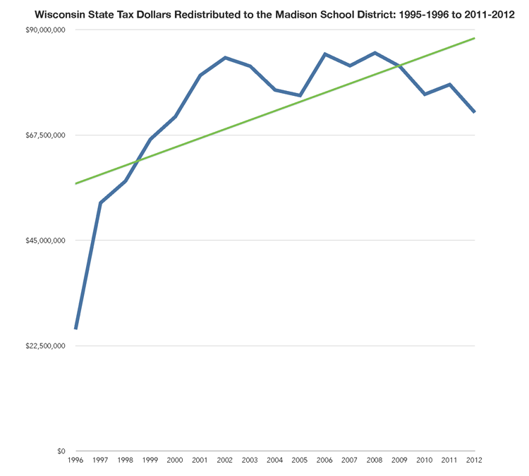
A rather remarkable chart from the Madison School District Admini$tration

Tap for a larger version (view the complete pdf slide presentation).
I am astonished that the Madison School District’s administration published this chart. Why not publish the change in redistributed state (and federal) tax dollars over time as a percentage of total spending, along with academic outcomes?
This chart displays Madison’s redistributed state tax dollar receipts from 1995 to 2011-2012 (more here and here):
Further, this (PDF) enrollment document is a surprise after the community (small percentage voting) passed a rather large facility expansion referendum in early 2015. These funds include the expansion of Madison’s least diverse school: Hamilton Middle School.