| School Information System |
|
|
 | Newsletter signup | Send us your ideas
July 19, 2006Comparing Low Income with Teacher AttributesThe question was recently asked on this site as to how teacher experience compared with poverty levels by school. Using the 2004-05 school data provided in the 2005-06 detailed budget, I compared low-income percentages with: number of years’ experience; % of teachers with advanced degrees; student / teacher ratio. Below are summary charts for all schools in the MMSD.
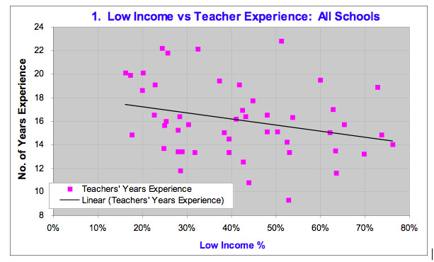
The first chart compares each school’s low-income percentage with the average number of years of experience their teachers have. Each pink data point represents a different school within the district. For example, the highest point on the chart represents Schenk Elementary School, which had 51% low-income (reading from the x-axis), and an average teachers’ experience of 22.8 years (reading from the y-axis). The black line is the Excel-generated trend line depicting the relationship between teacher experience and school poverty levels. Notice that the points in the chart are widely scattered - they are not closely surrounding the trend line. This dispersion implies a very weak relationship between teacher experience and poverty levels. The very weak relationship that does exist suggests teacher experience declines slightly as low-income levels increase. The oft-stated lament in this country is that as teachers become more experienced, they gravitate toward the “easier” schools with fewer low-income kids. In the MMSD at least, that gravitation appears to be occurring at a remarkably slow rate.
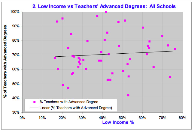
The second chart compares low-income percentages by school with the percentage of teachers that possess advanced degrees. For the MMSD, as school poverty levels increase, there is a slight increase in the percentage of teachers with advanced degrees. However, the relationship is virtually non-existent. Nonetheless, the general literature in this country would suggest teachers with advanced degrees tend to gravitate to schools with lower poverty levels.
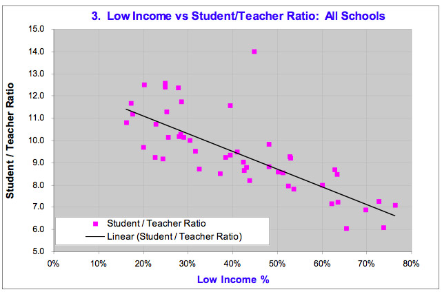
Finally, the third chart compares school poverty levels with the student / teacher ratio. Here there is a very clear relationship: the student/teacher ratio declines as low-income levels increase; (i.e. there are more teachers per student as poverty increases). Unfortunately, there is one important caveat here: schools with higher levels of poverty typically have more students requiring special education or English as a Second Language. To a certain extent, the lower student/teacher ratios reflect the higher number of teachers required to meet those additional needs. Therefore, one has to be careful precisely how to interpret this chart Posted by Peter Gascoyne at July 19, 2006 4:50 PMSubscribe to this site via RSS/Atom: Newsletter signup | Send us your ideas
|